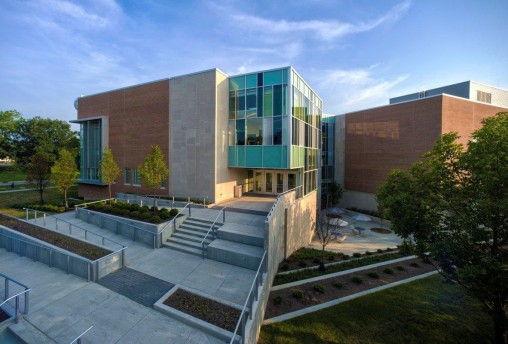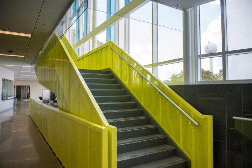
Wright State’s new Student Success Center features high-tech, active-learning classrooms, writing and math support labs and an outdoor rain garden. (Photos by Will Jones)
There’s a light show every day inside Wright State University’s dazzling new Student Success Center.
The strategic placement of windows and glass makes natural light the centerpiece of the building’s design.
“As the sunlight moves and the shadows shift, the colors in the building change,” said architect Andrew Circle of Annette Miller Architects, the firm that designed the building.
Mason Waldo, the interior designer, said the building’s materials are purposely neutral to enable the light to “literally shine.”
“My hope is that someone who is in there all day appreciates that — that it’s different in the morning than it is in the afternoon. It’s different in the summer than it is in the winter too,” said Waldo
Annette Miller Architects is beginning to rack up kudos for the building.
The building’s design won a 2016 Merit Award for newly completed buildings from the Dayton chapter of the American Institute of Architects.
And design of the building’s common areas was recently honored by American School and University magazine, which featured it as an “Outstanding Design” in an educational interiors showcase competition of buildings from kindergarten through college.
“I think it speaks to the quality of the design, the importance we put on the public spaces,” said Circle.

The strategic placement of windows and glass makes natural light the centerpiece of the Student Success Center’s design.
The $17 million Student Success Center, which opened in 2015, features high-tech, active-learning classrooms, writing and math support labs, and even an outdoor rain garden that underscores the structure’s environmental embrace and helped give it a Silver LEED certified designation by the U.S. Green Building Council.
The three story, 67,000-square-foot building has oceans of open study space, including broad-shouldered hallways and corners populated with whiteboards as well as comfortable chairs and benches. Students who want to meet with team members following classes can slip into “huddle” spaces — small glass-enclosed rooms outfitted with tables and chairs.
The structure also has shading fins and about 1,200 exterior glass units. The floors are polished concrete. Walls are clad in porcelain ceramic tile. The top floor offers a sweeping view of central campus.
Annette Miller Architects generated several concepts for the building even before the firm won the contract in 2012. The five different roughed-out ideas spoke to how the building might sit on the site and how occupants might move through the structure.
“We decided to just go ahead and try to throw some ideas out there to spark some imagination and to spark some excitement about what we could bring to the project,” said Circle.
Once the two designers got a budget and programmed what activities and functions the building needed to house, they began working with shapes, forms and sizes and crafting block diagrams. They started out with numerous design schemes and began to edit them down.
“We model everything in 3-D so we have a lot of ability to visualize what the result will be,” said Circle.
One unusual feature of the building is that its two entrances are on different levels.
Traditional classroom buildings typically have double-loaded corridors, with the hallway in the middle, classrooms on both sides and little natural light in the corridor.
“Rethinking the traditional building type is what led to this facility,” said Waldo. “We immediately pushed against that traditional notion.”
He said the designers eventually settled on a single-loaded corridor.
“You come in on one level, you see one thing, then you make the turn and you see something else. You go down the steps and see something new,” he said. “There’s a constant display of the building design along that path.”
 Once construction began, Annette Miller Architects held weekly job meetings with the contractors and university facilities staff. The building design was refined as the functions evolved, such as adding glass to the tutor scheduling area.
The new building houses University College, which moved from the windowless basement of Dunbar Library. Users of the new building wanted an abundance of natural light.
“When we decided to focus heavily on how natural light works in the building, it began to drive a lot of the decisions,” said Waldo. “The natural light and the access to views was a primary player in the development of the design. It was not something that just happened.”
Waldo attended Wright State from 1994 to 1996, majored in human factors engineering and worked part-time in the facilities planning department. He later got his bachelor’s degree in interior design from the University of Cincinnati.
He said the Wright State students are in a “pivot point,” transitioning from one phase of life to another.
“Creating spaces for those people I find particularly challenging,” he said. “It’s a fun group to work with.”
Since the Student Success Center open opened, 16 percent more students have been served in the building’s Academic Success Centers and there have been 31 percent more total visits. The Math Learning Center alone more than doubled the number of students it served.
“Certainly the new space had something to do with that,” said Tim Littell, executive director of student success and associate dean of University College.
Circle said it is gratifying to see that the building is heavily used.
“It’s crazy how many people are in there,” he said. “The increase in repeat visits is probably the most exciting to us. For people to come back continually means that the space is doing what we hoped it would.”

 Wright State medical students bring medicine to life for Mini University preschoolers
  Wright State Theatre to present rom-com musical ‘The Wedding Singer’
  Heavy metal learning
  State grants to bolster Wright State’s electric vehicle and advanced manufacturing training for students
  Wright State partners with local universities, hospitals to expand mental health care for students